

THE RETAINED IDENTITY
Good taste travels.
An octagonal lattice inspired by traditional windowcraft, paired with delicate Latin lettering. ZENDAMA connects ingredients, makers, places and the table. Preserve the original proportions and breathing room rather than adding decoration.
01 / Logos
One identity. Three compositions.
Choose the emblem, wordmark or horizontal lockup to suit the context. All SVG lettering is outlined; no installed font is required.

The checkerboard indicates transparency; it is not part of the downloaded file. View white and ivory logos against a dark background.
 WHITE / REVERSED
02 / Colour
Warm paper. Two deep inks.
Burgundy and ivory form the core. Deep green is the secondary brand colour; sage, brass and porcelain support backgrounds and details. These are digital sRGB values.
Plum Burgundy
RGB 88 / 41 / 54
Warm Ivory
RGB 245 / 240 / 231
Porcelain
RGB 251 / 248 / 242
Sage
RGB 173 / 185 / 165
Deep Green
RGB 60 / 85 / 76
Brass
RGB 170 / 146 / 112
Ink
RGB 41 / 44 / 37
03 / Typography
Keep the lettering. Make the text readable.
The logo is based on Cormorant Garamond Regular 400. Do not retype it: use the downloaded outlined SVG. Its spacing and proportions are part of the original.
Logo · Latin headlines
Good taste travels.
Cormorant Garamond
Regular 400; Italic 400 also appears in the website’s editorial typography.
Official typeface ↗Latin UI · Numerals · Supporting text
Aa 0123456789
Manrope
Variable font. It is not a complete Korean or Japanese typeface.
Official typeface ↗Korean · Japanese serif headings
식탁에서 세계로.
Noto Serif KR / JP
Regular 400. Korean and Japanese sans-serif body text uses the website’s system-font fallback stack.
Official typeface ↗These typefaces are distributed under SIL Open Font License 1.1. The pack contains licence copies and official sources only. Obtain desktop TTF/OTF from the official projects and check the licence for that version. Font licensing does not transfer rights to the logo.
04 / Usage
Small rules. A considered finish.
Clear space
Allow at least 1/4 of the emblem width. For a lockup, use its embedded emblem width; for a standalone wordmark, 1/2 of the capital height is the working recommendation.
Minimum size
Emblem: 28px digitally / 12mm in print. Proof wordmarks and lockups at a size that preserves their finest strokes. A single dimension cannot guarantee every production process.
Scale and resolution
Prefer SVG for print. PNG exports are 3200px wide for the emblem and 4800px for wordmarks and lockups. At 300ppi that is approximately 271mm / 406mm; actual reproduction depends on process and stroke width.
Background and contrast
Use burgundy, green and black on light grounds; ivory and white on sufficiently dark grounds. On photographs, place the logo in a quiet area.
Please avoid.
05 / Applications
On paper. On the shelf.
Applications using the same original assets. These label, sleeve and box studies communicate design direction; they are not dielines, regulatory labels, measured layouts or press-ready artwork.
ZENDAMAGOOD TASTE TRAVELS GOOD TASTE TRAVELS
 ZENDAMA
06 / Downloads
The right file for the next step.
This pack contains public logos and production guidance only. SVGs are existing vector originals or colour-derived versions; PNGs are new high-resolution renders from those SVGs. Font binaries, internal documents and print dielines are not included.
Files by colour
Emblem

Wordmark



Horizontal lockup












07 / ZENDAMA COFFEE
Licorice coffee. Five new expressions.
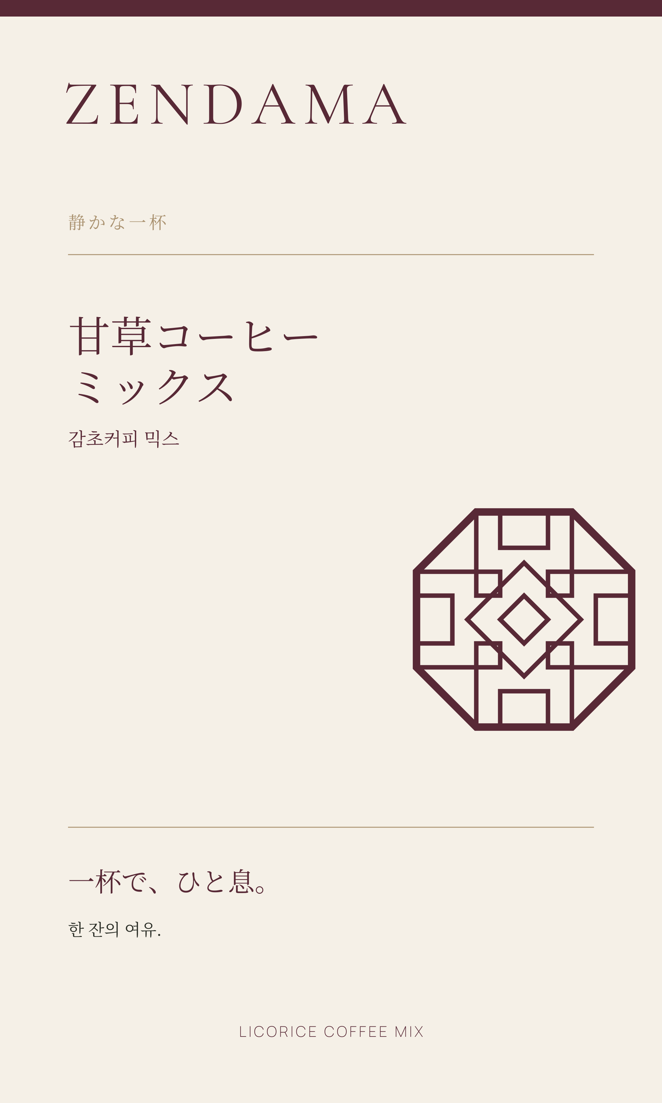
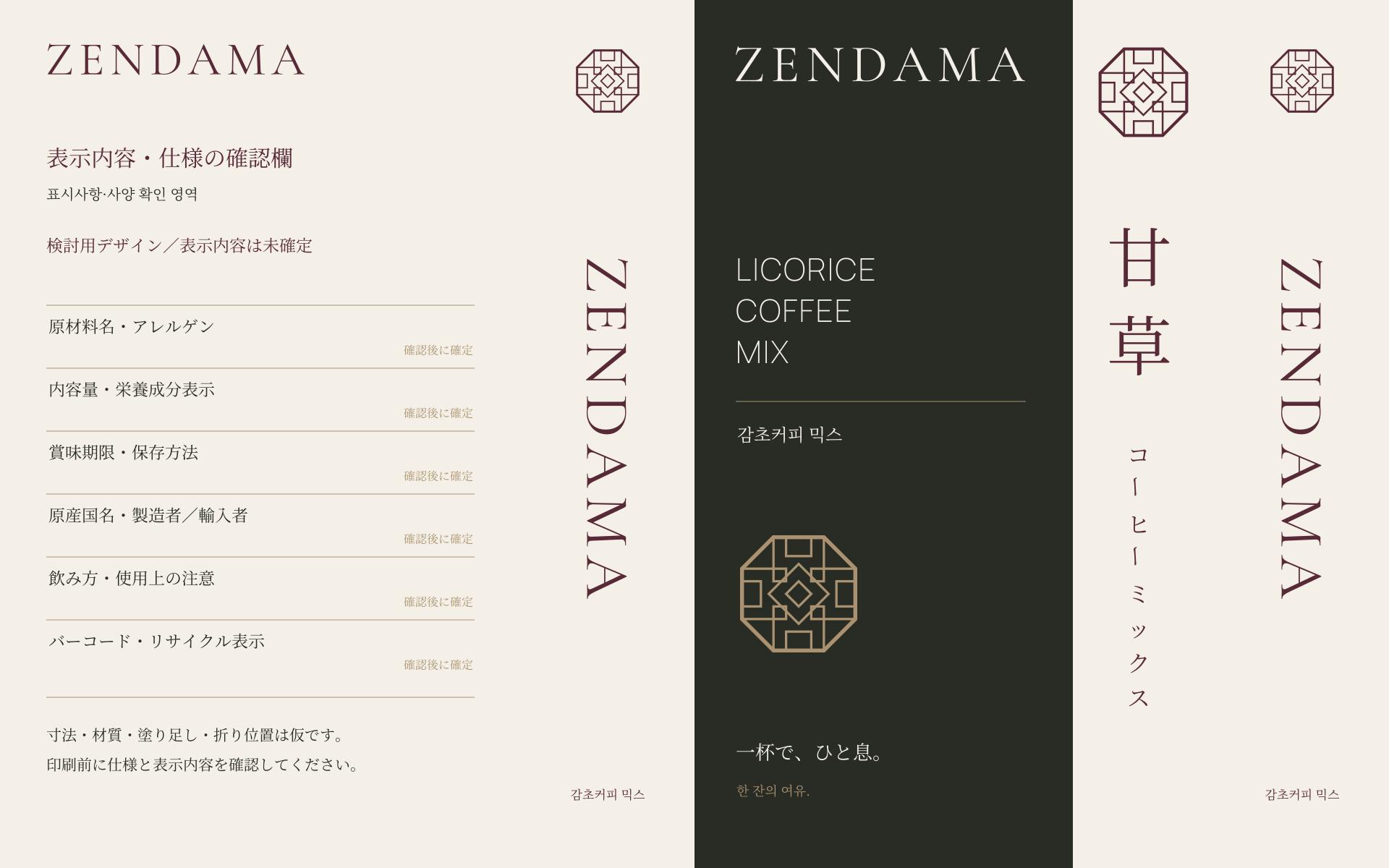
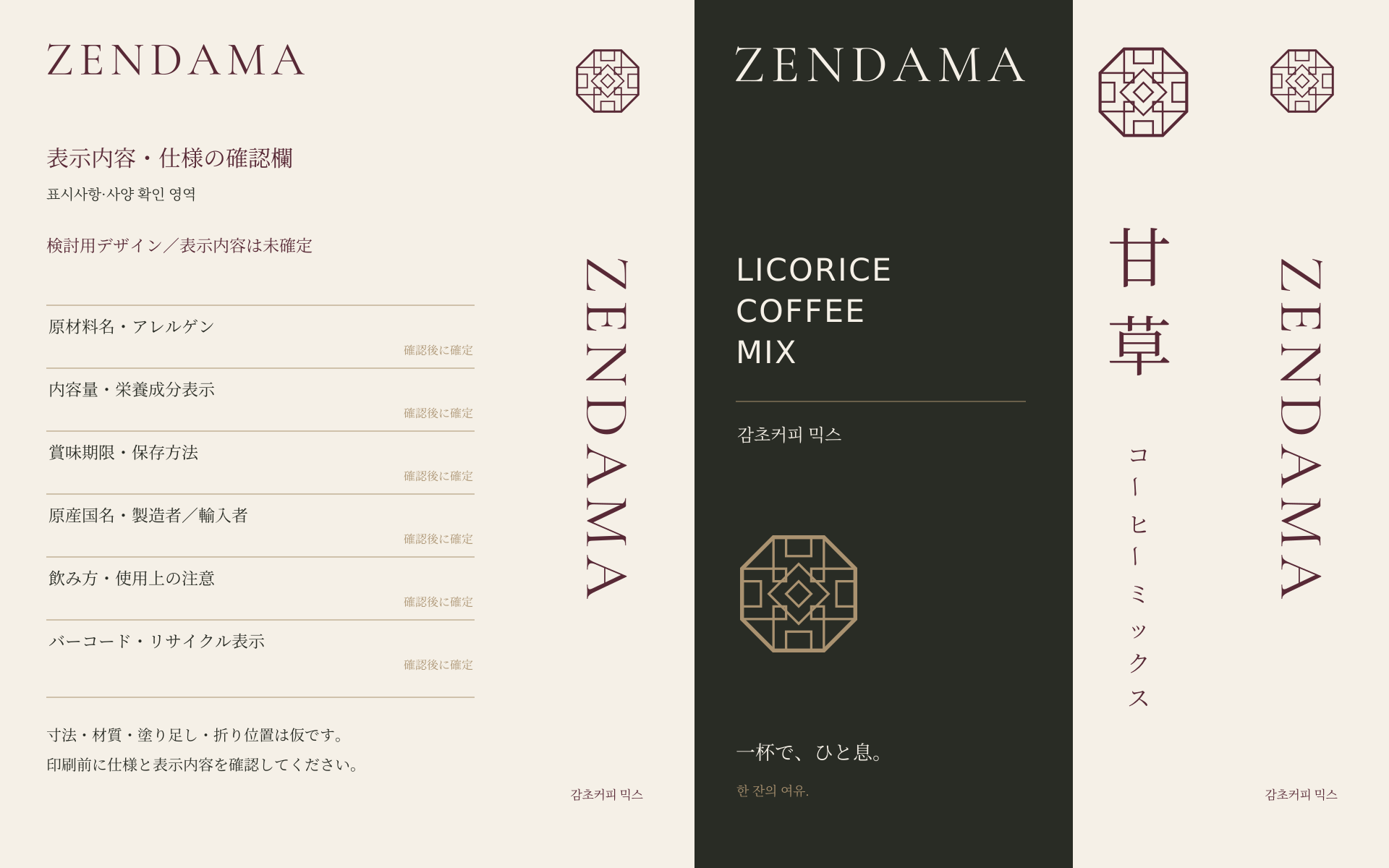
Five ZENDAMA directions for the Japanese market, alongside the supplied original packaging. Japanese leads, with smaller Korean supporting text.
BEFORE / ORIGINAL
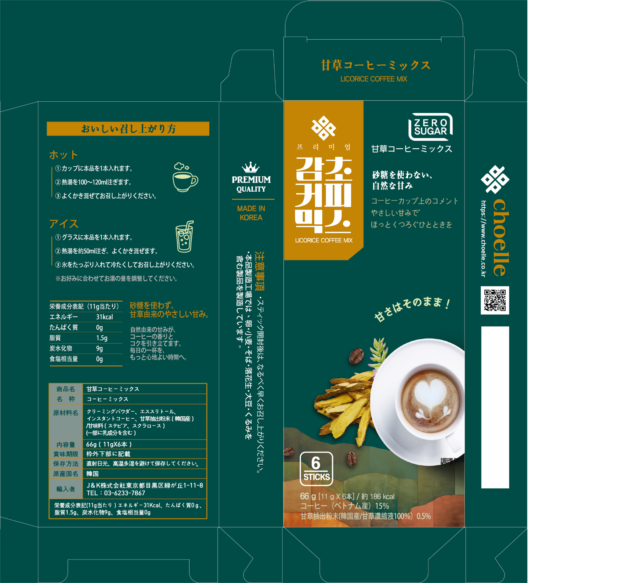
Original packaging reference
The original PNG supplied by the user. Compare it with the concepts below, or download the original file.
Download original PNGDesign review only · Not production-approved
All five are design concepts. Product naming, formulation, ingredients, allergens, net quantity, manufacturer/importer, date marking and Japanese mandatory labelling require actual specifications and separate review. Layouts are structural studies, not approved dielines or press-ready artwork.
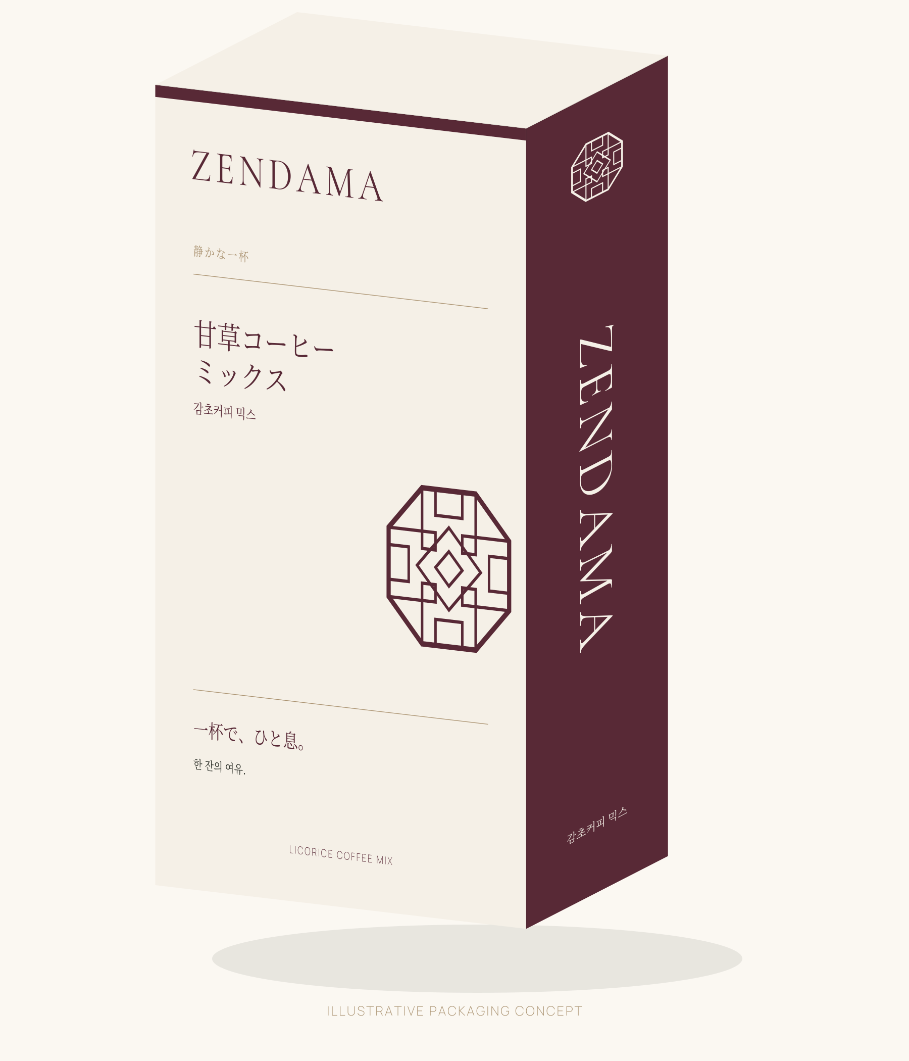
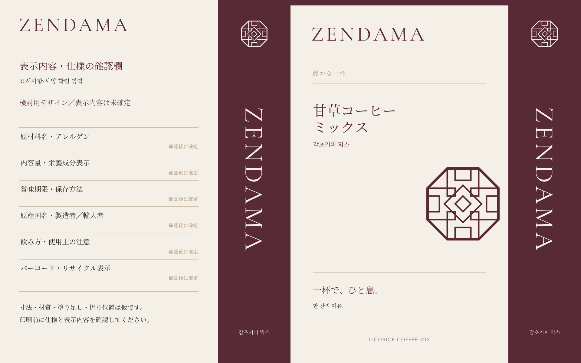
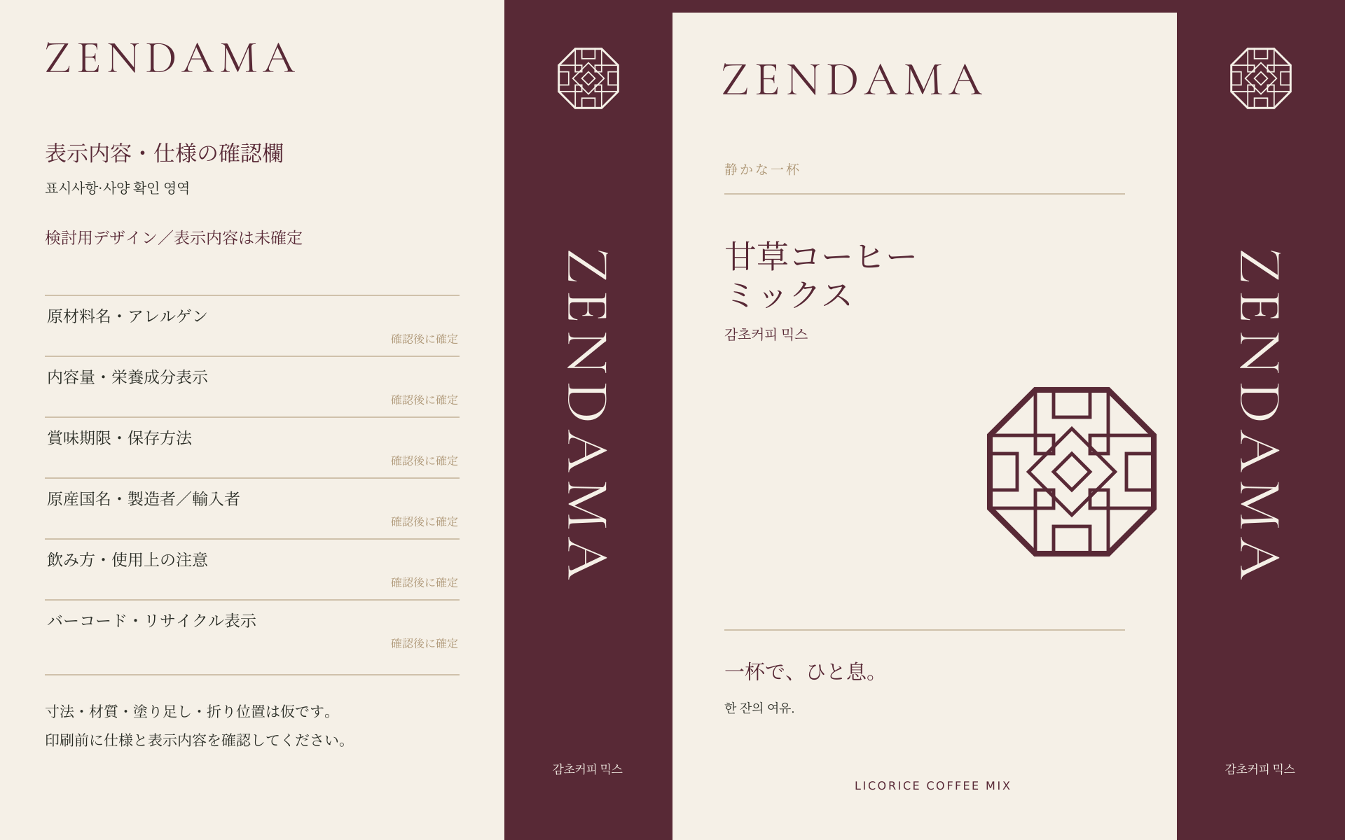
DIRECTION 01
Hanji Editorial
Warm ivory, asymmetric spacing, and a cropped architectural emblem.
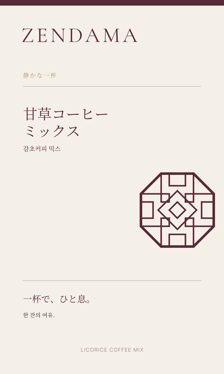
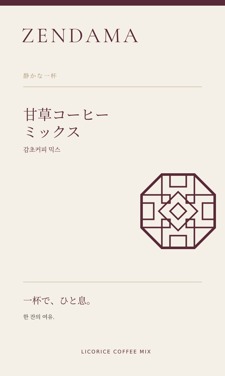
DIRECTION 02
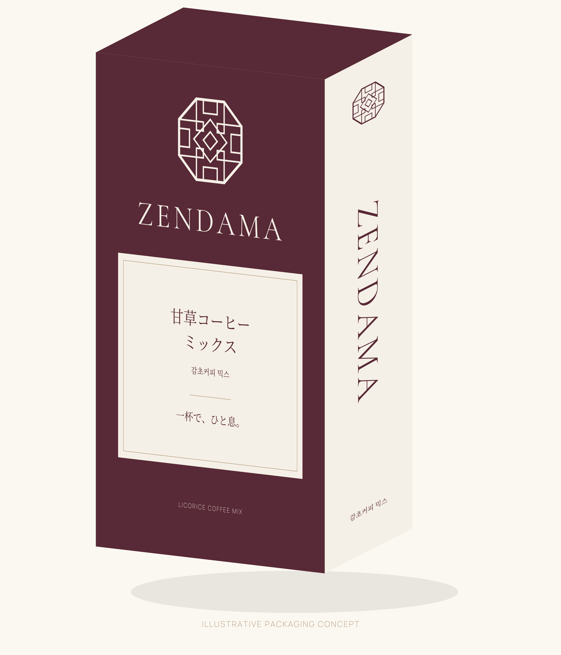
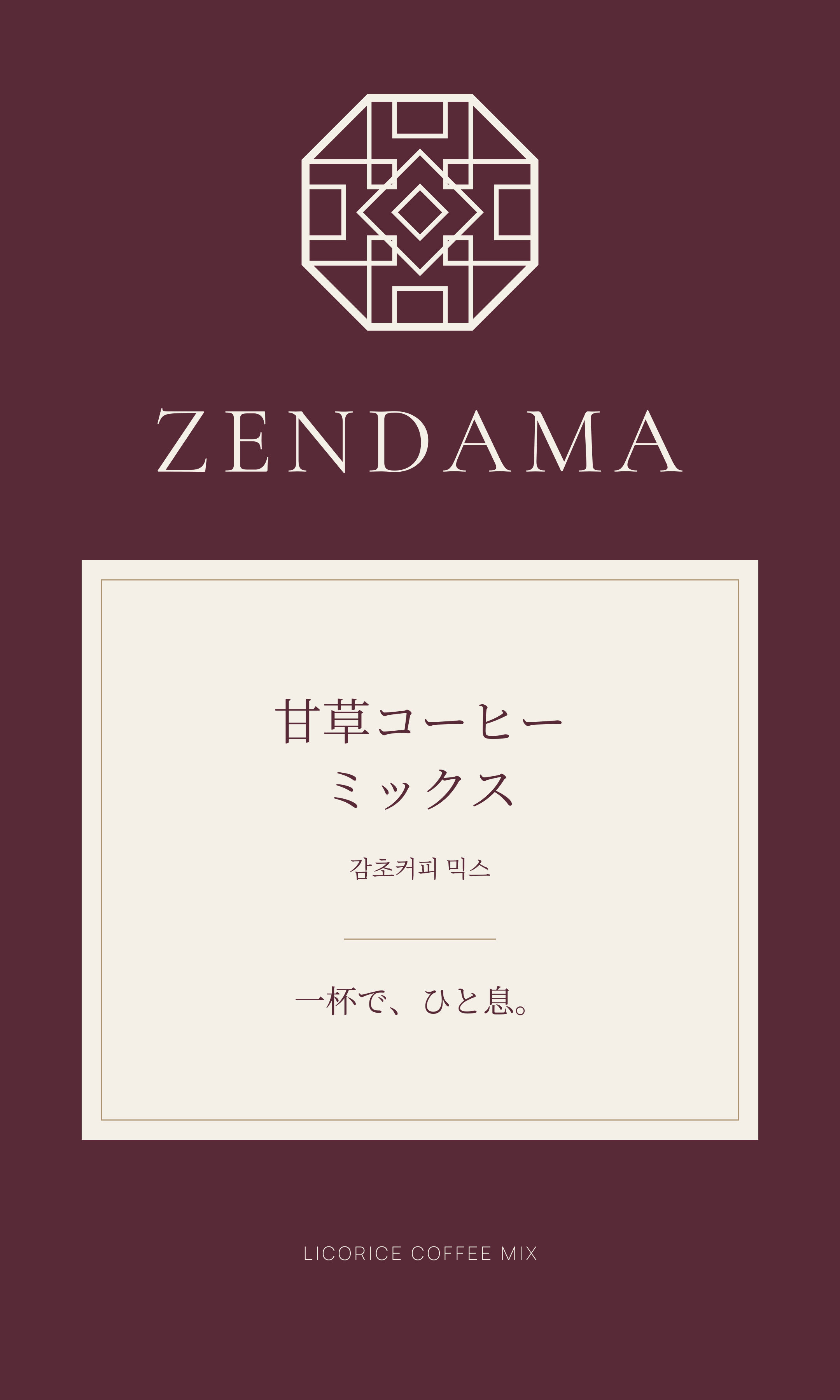
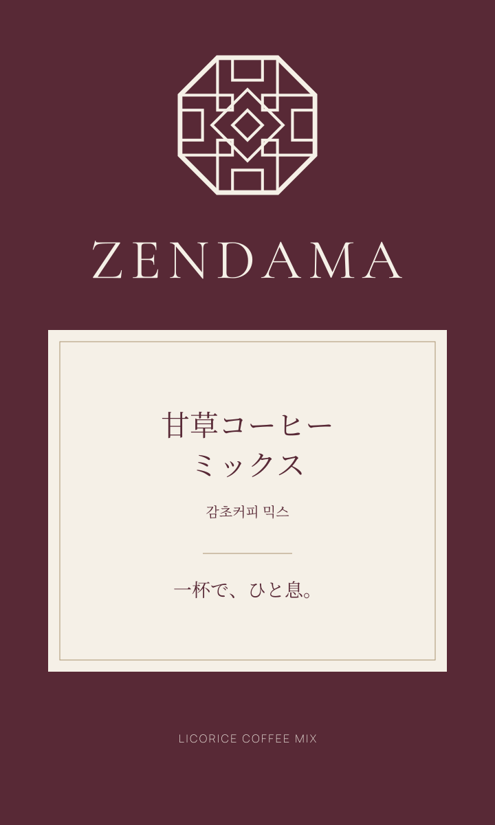
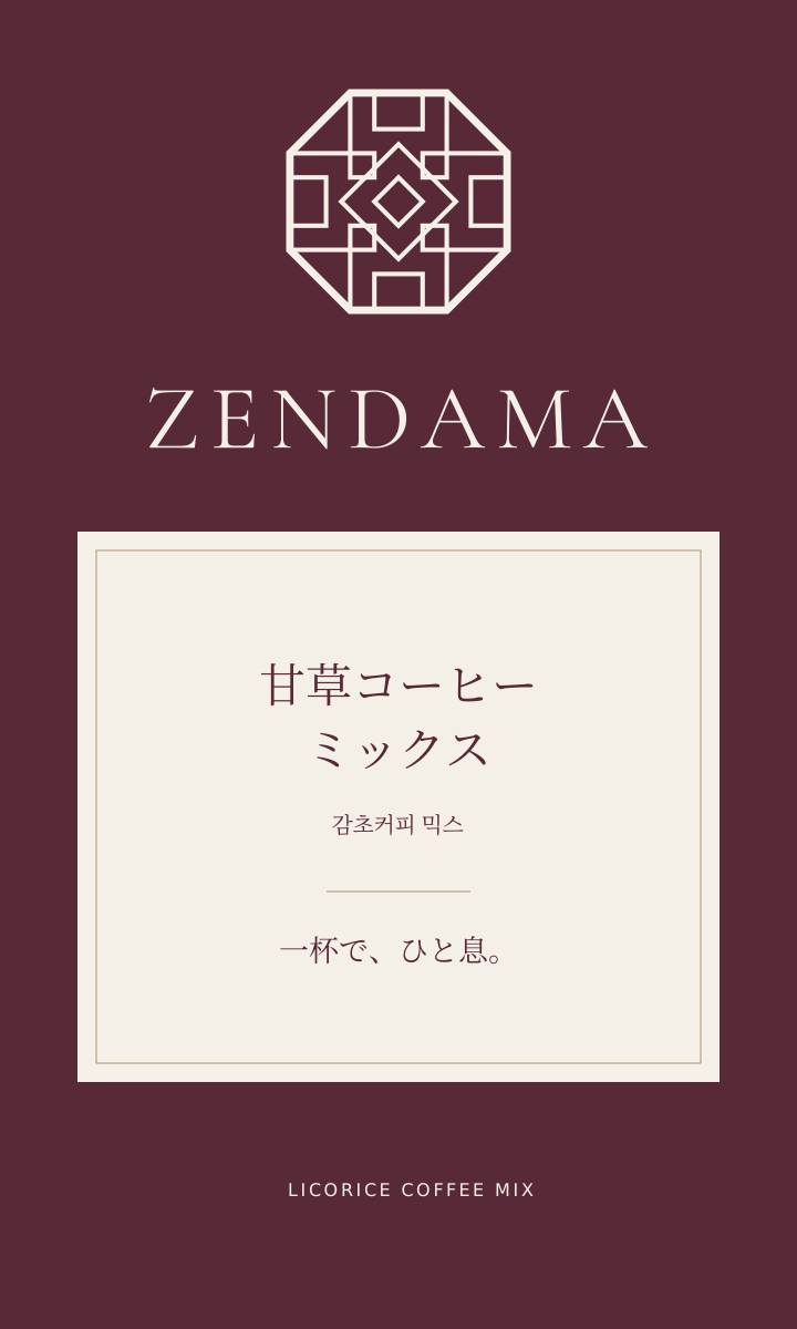
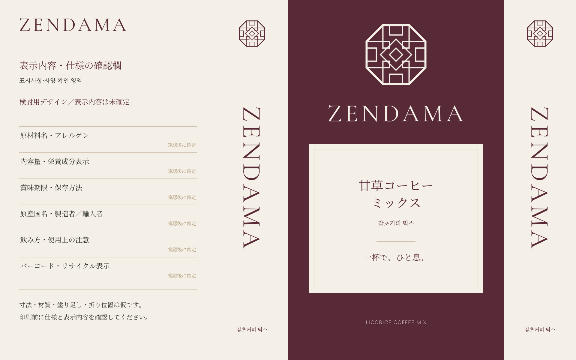
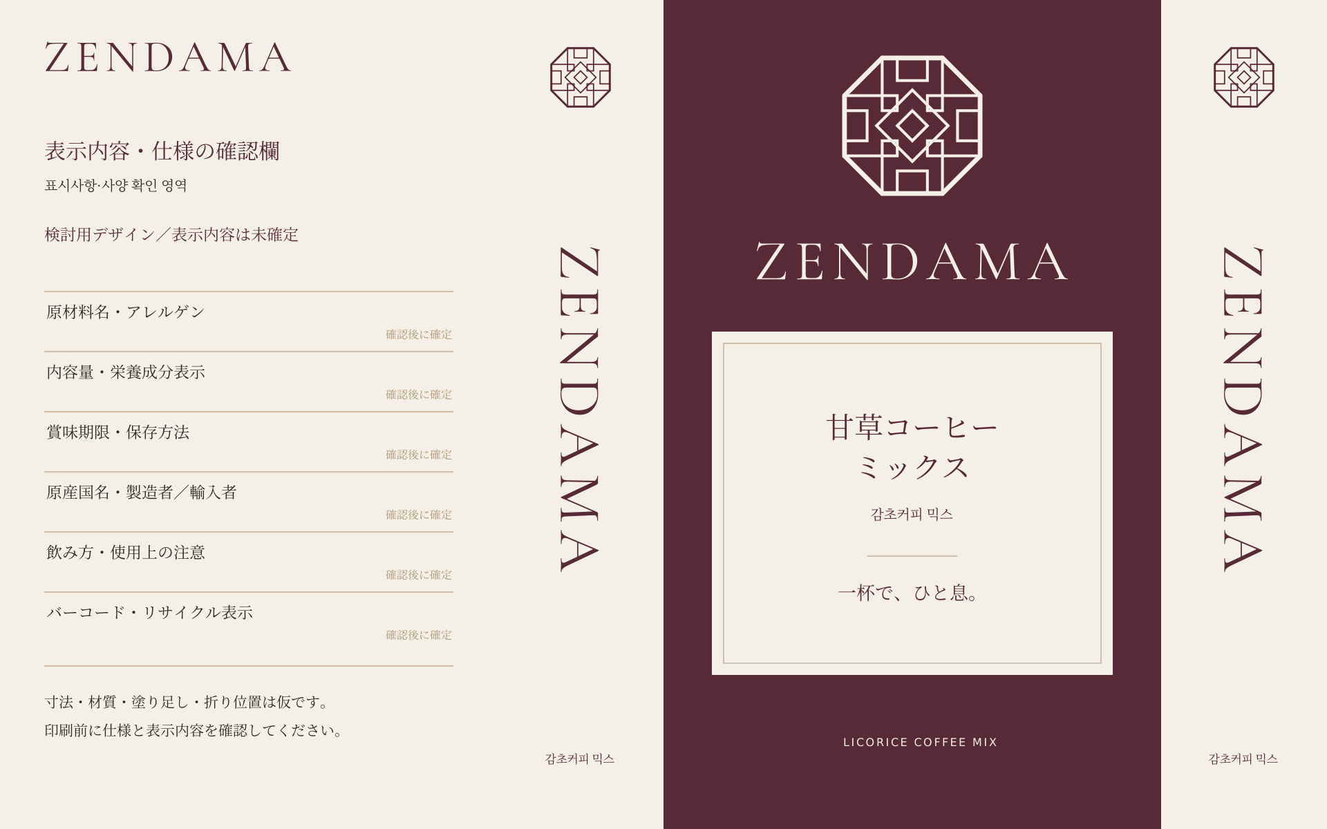
Burgundy Window
A burgundy field frames a refined ivory label.
DIRECTION 03
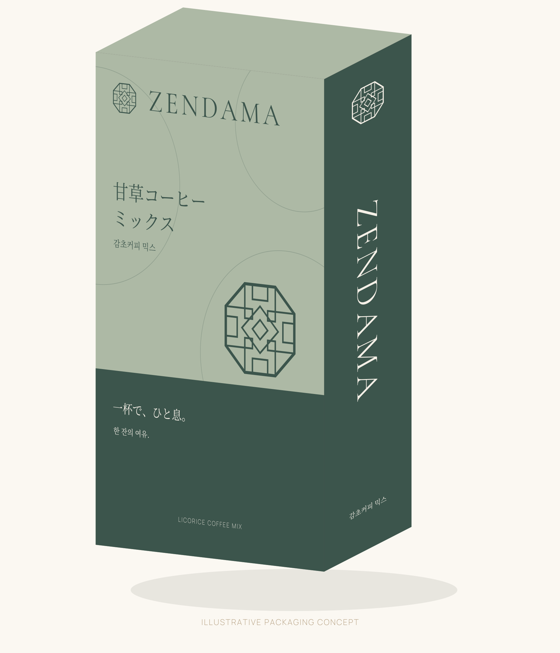
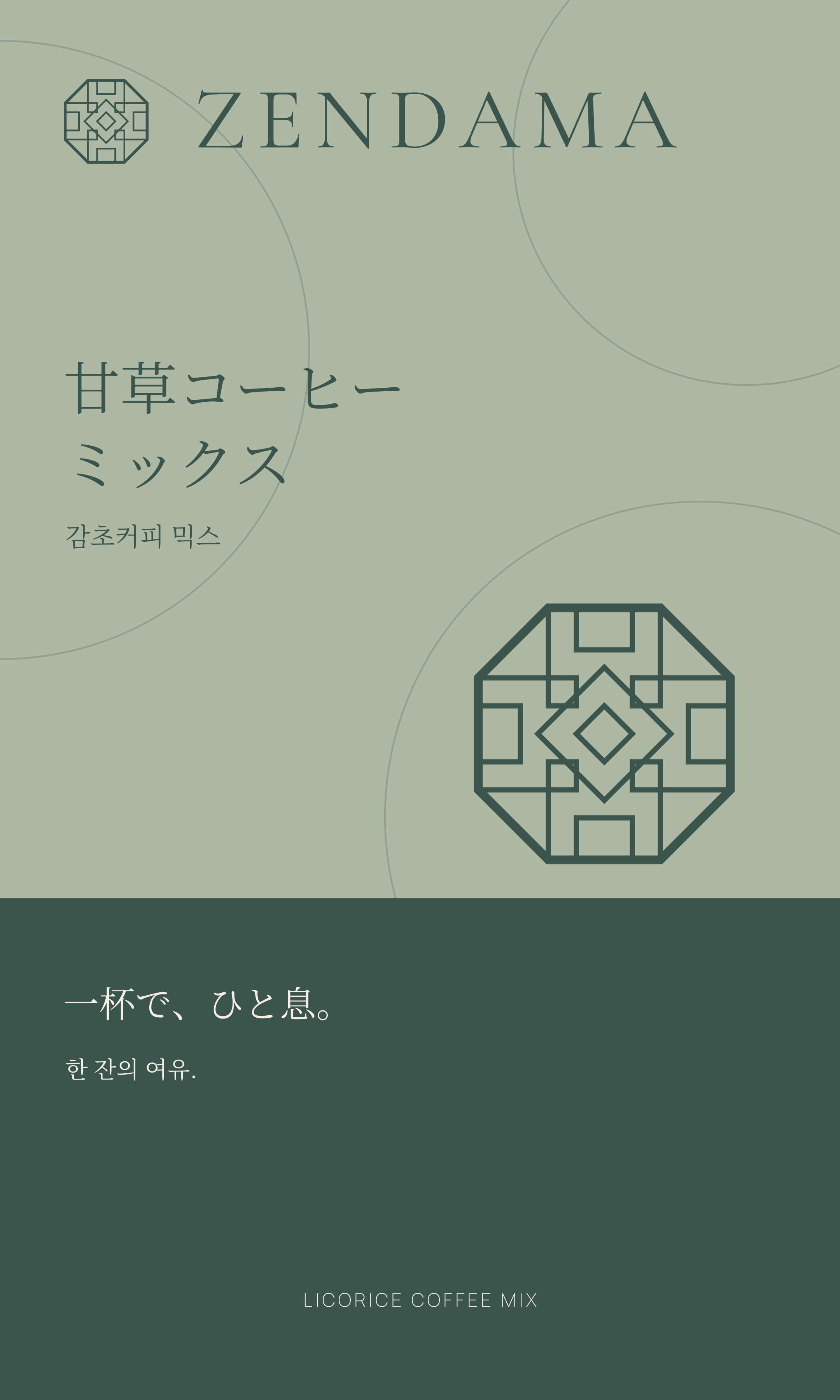
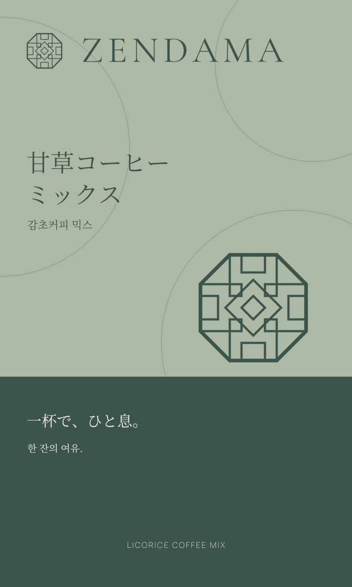
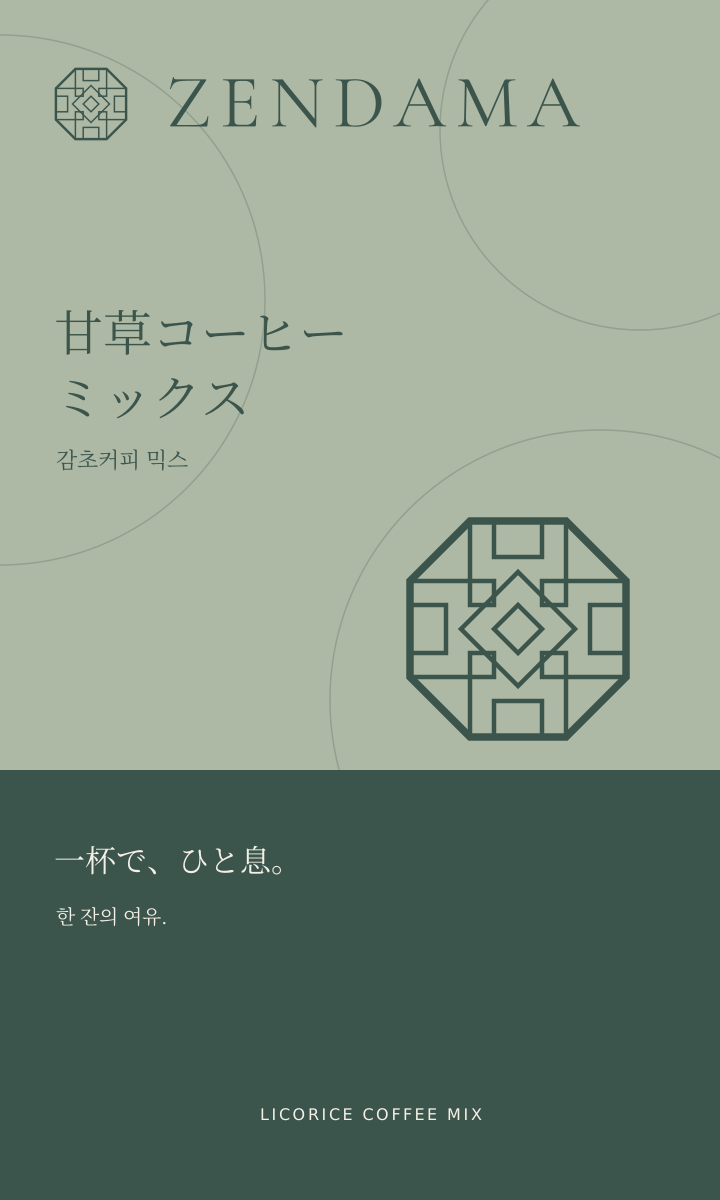
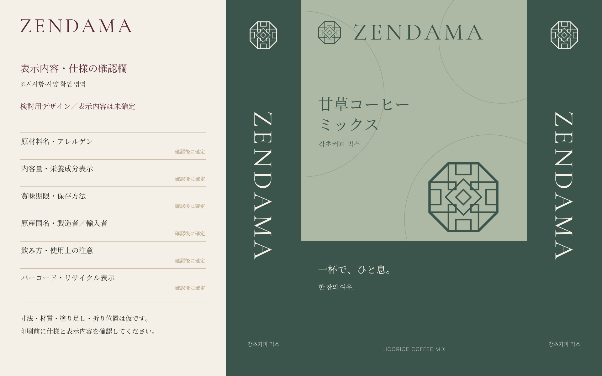
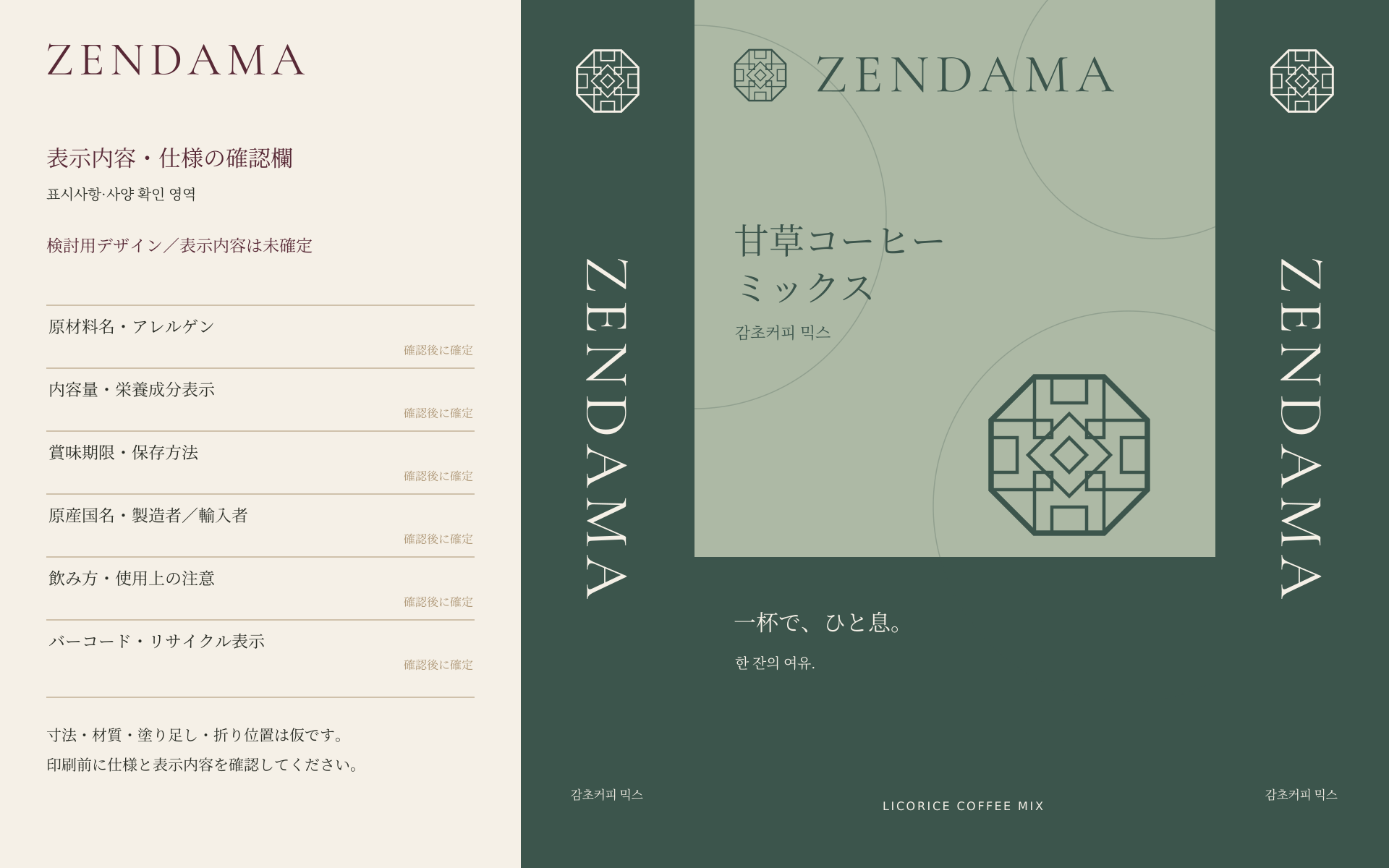
Celadon Rhythm
Celadon and deep green blocks meet restrained circular geometry.
DIRECTION 04
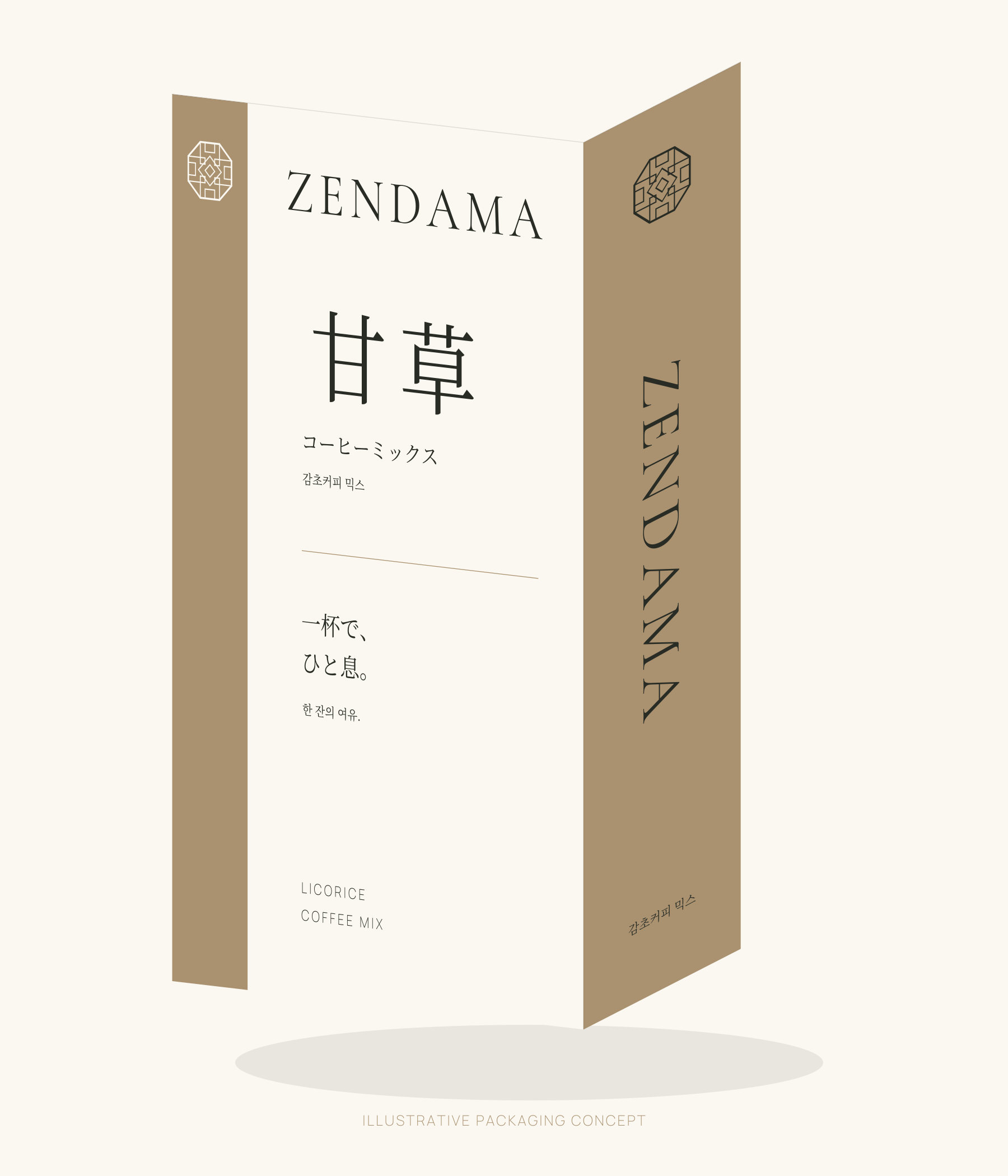
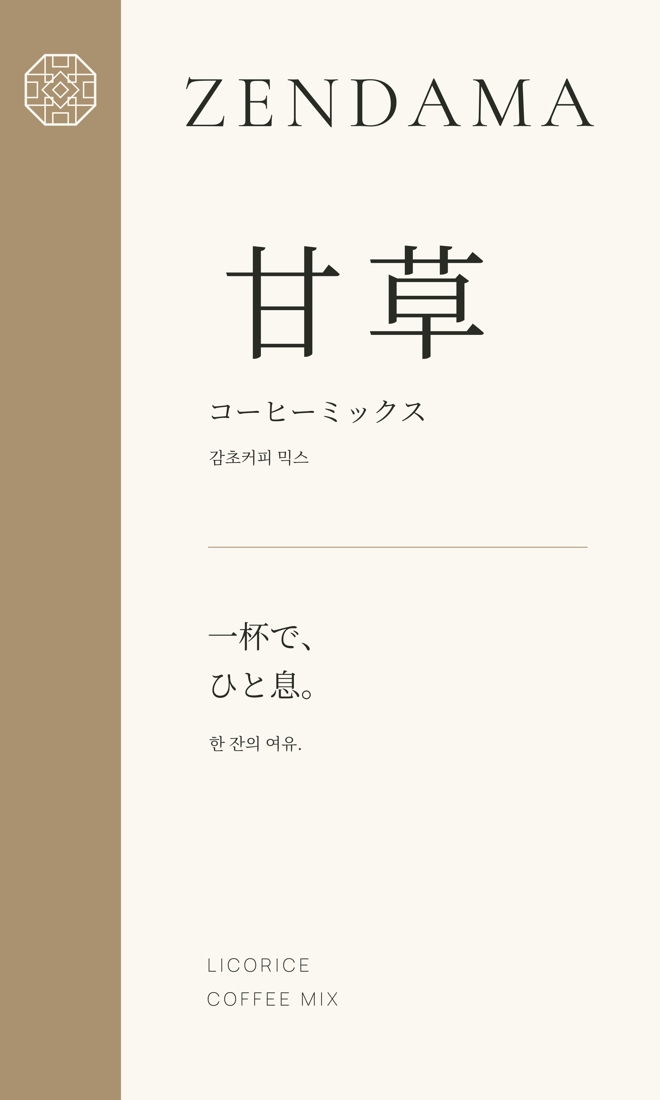
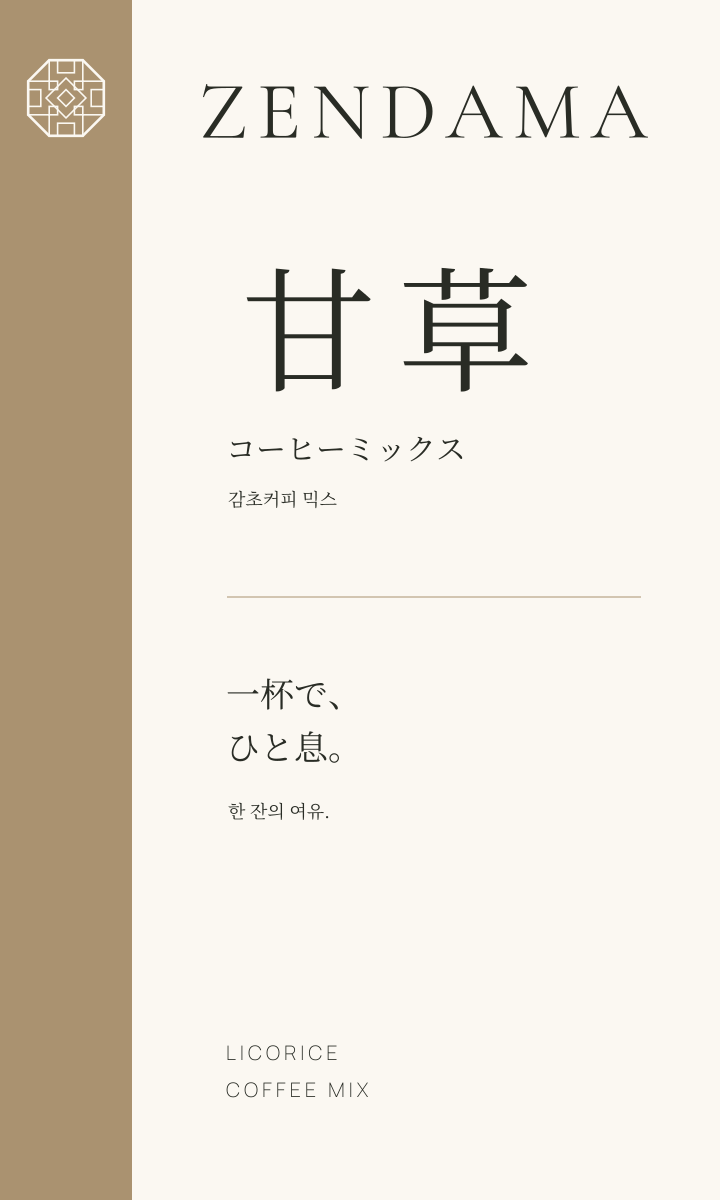
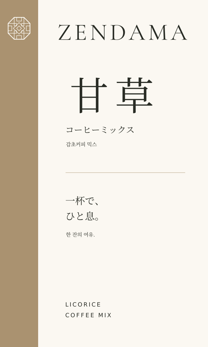
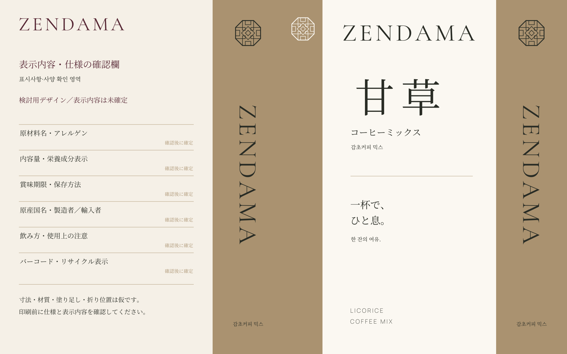
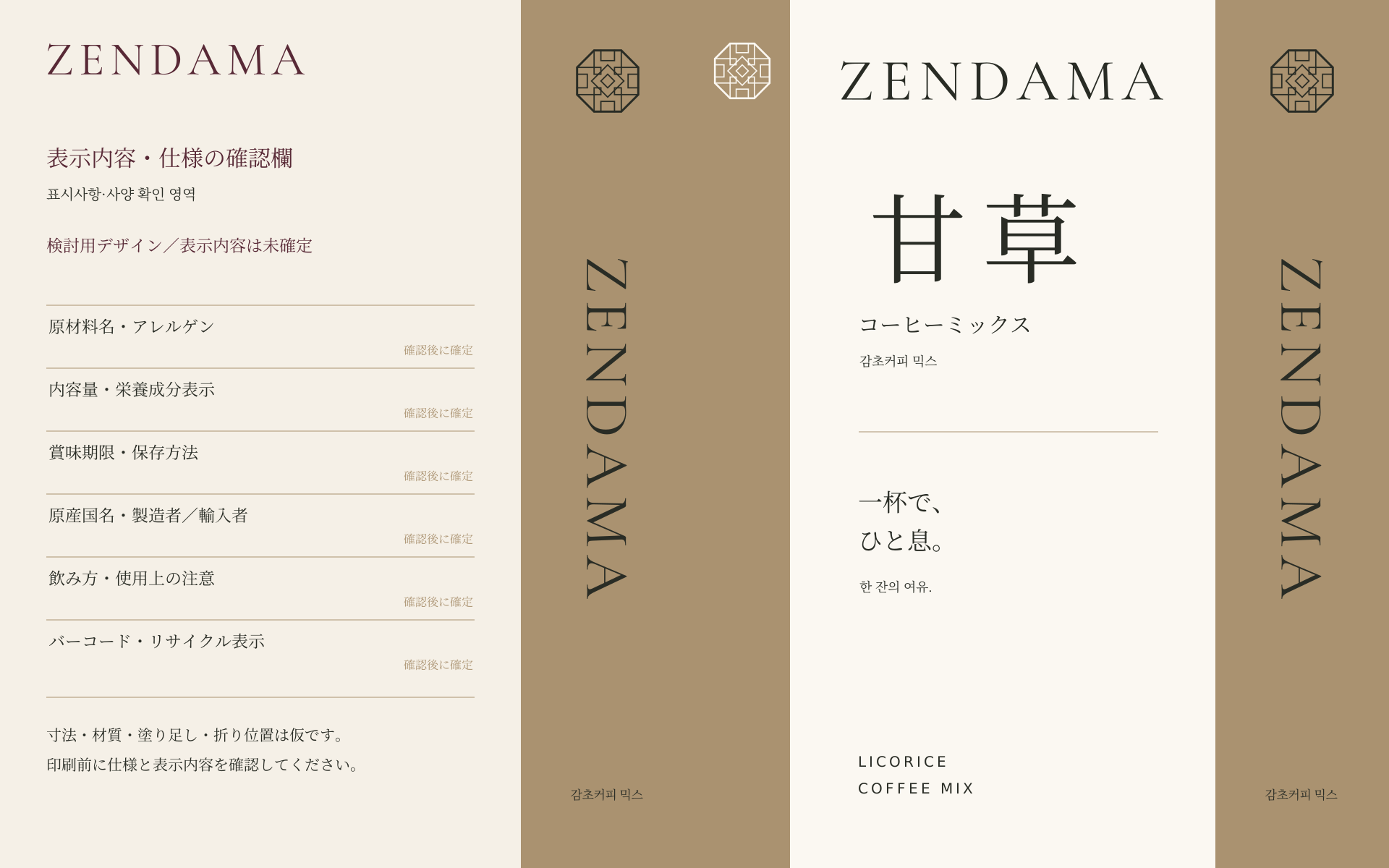
Brass & Space
A brass spine, large kanji, and generous space create quiet refinement.
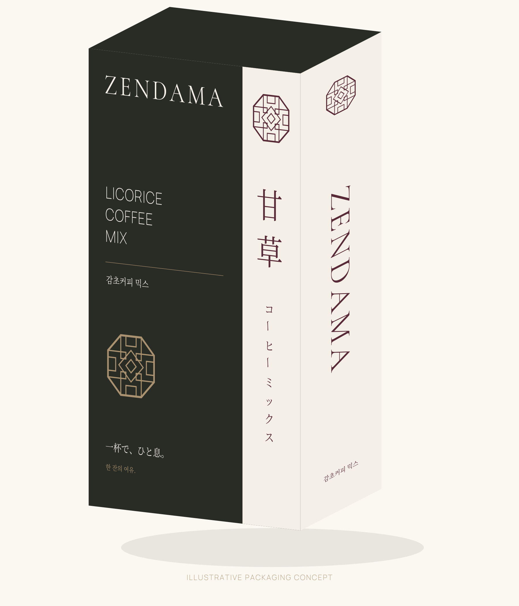
DIRECTION 05
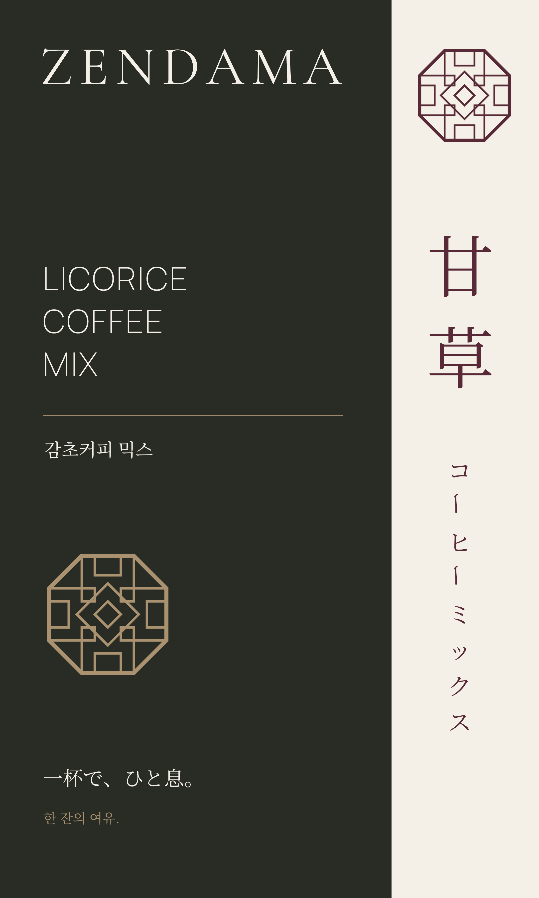
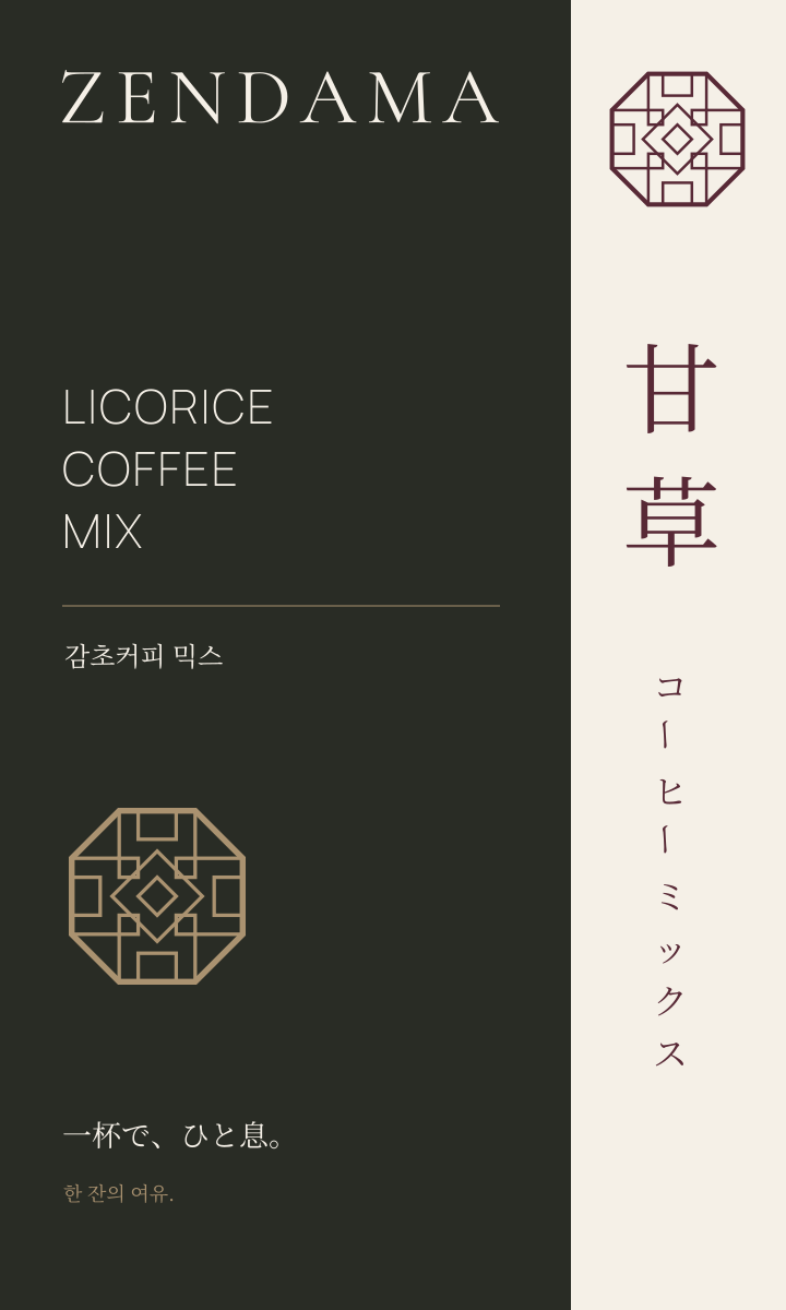
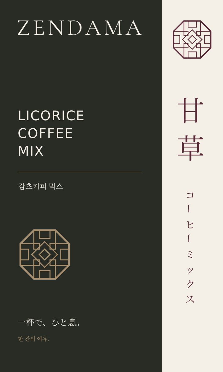
Ink Typography
Ink and ivory juxtapose vertical Japanese with confident Latin typography.
Download all 5 concepts + original Complete pack · 3.13 MB
Outlined SVGs open without installed fonts. For editable SVGs, consult the included font guidance and licences. Mockups are composed from vector artwork.
Production notes · Licences